Thursday, December 13, 2012

Deeper Study

 At first, I was not sure how to set up my puppets. I had trouble figuring out how to differentiate between the two tigers, as the difference between male and female tigers is so subtle. Really, male and female tigers look similar, but the females look smaller. This size difference would be noticeable in the scenes where the tigers are together, but would be hardly noticeable in the majority of the scenes in which they are separate. So, I decided that changing the stripe colour would be less imposing and would fit with the bright colourful stylized nature of the video. I also made subtle differences in the faces of my characters. The female has a pattern around her eyes that suggest eyelashes and a thinner jaw and eyebrows than the male. You can see the difference in this shot


After looking through my Story Board and factoring in the subtle difference between the bodies of the different genders, I decided that creating separate male and female bodies would make for double the work. Instead, I decided a better and faster option would be to make one body for each position and change the colours of the stripes using colour correcting effects in After Effects. This way I could cut my puppet making in half.

To make the puppets I first found pictures of tigers online in positions that I enjoyed, cut them up and adjusted the  anchor points like I would a puppet, but in photoshop.


P.S.  The giant Cintiq was my best friend in creating this video.

After testing out this puppet, I traced the outline of the pieces and painted/adjusted them to make them look like my stylized tigers.

I would then scan these hand painted puppet pieces into the computer and erase, arrange and set up the files for animation.

To Animate my puppets I used the DuIK rigging system. This plug in was designed for human character animation, So in a way, I was conducting my own little experiment by using the rig for Tigers. However, I was very impressed with the results using this rig, and had a lot of success with it.

First, I used the rig on my Human Ring Master puppet character.

Here you can see how the rig is set up:
A series of controllers are set up and parented to the  limbs.


The result is a very natural moving character and a much more organized and less hectic amount of keyframes. There is no way I could have got the smooth and controlled result that I got if I animated each piece of the puppet separately rather than on the set up controllers.

Here is a fun video showing the results of my Ring Master Walk Cycle:


Ring Master Walk Test from


For the Tiger, I first would animate the body using the DuIK system and then the Head to create the expressions, and then combine them later. 


Here is a run cycle test I did using the DuIK system(don't be scared of the headless-ness)


 For the backgrounds I created a library of leaves and trees as well as grass and dirt and would rearrange them for all the jungle scenes. I found this technique was the fastest way to get things done. I would have preferred to spend more time on the backgrounds.

I used 3D layers for most of the scenes. Including the inside the cage scene and the majority of the jungle scenes.


Here is my first failed attempt at creating a grassy open field.. it just wasnt bright and pretty enough.


Here is another failed attempt at a passed out tiger position. Looks too human and terrible.


Overall I am pleased with the result. I would describe this video as "half-animated" there are very subtle, robotic movements mixed with a lot of still frames. I would have loved to go in and spend more time animating each scene.

In the future I would like to use toggle hold keyframe interpolation to achieve less robotic looking animation.

Expirimental Animation Final

After months of work, HERE IT IS!


My Tiger Love Story music video is a fun twist on the classic love story. The tale of the two Tiger lovers highlights both the strain of a long distance relationship and the compromises that one inevitably must make to keep a relationship alive.

Towards Expression

For my Final Directed Project I intend to make a music video to the song "Stairway" by Yukon Blonde, a Vancouver-based bad that I love. I always make an effort to keep my work local because I often feel that as Canadian students, we often overlook our own country in our work.

I will be experimenting with puppet animation. I intended to use classical 'under-the-camera' puppet techniques, but this did not work out very well as my control and time was limited. I instead   computer based puppets in After Effects. This way I could have more control with the puppets and a higher resolution video.

In After Effects I can have more dynamic camera moves and create a multiplane effect that I could alter and move more freely than if I was working under the camera on a real multiplane. I love the look of classical under the camera animation, but I don't think I have the time to create a successful story using  this technique.

I spent a large portion of the semester planning out what puppets and facial expressions I would need to create this video. I also spent many hours hand painting, scanning and preparing the puppets in photoshop.

However, my main concern for this assignment was to tell a story, so the aesthetics were secondary.As long as my story structure was readable, I would be happy.

Here is the animatic for my piece:


Animatic/Storyboard for Yukon Blonde's "Stairway" music video from Rebecca Rochon on Vimeo.


I used neon paints to create my tigers and backgrounds, as I wanted the video to be bright and colourful. However, this turned into quite a hassle. Neon colours are outside of a computer's RGB spectrum so my scanned images were never true to colour. 

I have had this idea in my head for quite some time so I thought it would be an excellent opportunity to create a project that I could be proud of, something of personal significance, other than the usual walk cycles and technically driven assignments that I am usually producing!


Wednesday, October 3, 2012

Emily Carr Bumper Ad

For my Motion Graphics, we were told to create a 30 second bumper ad for our school, Emily Carr University of Art and Design. I decided to do a parody ad.

and yes... that IS my voice haha

 Maybe I should just become a voice actor...


Emily

Some Crazy Walk Cycles!

Here are some of my walk cycles for my 2D animation class.

I'm a weirdo.


Heron Walk from Rebecca Rochon on Vimeo.

Tim Burton Style Layout

In my 2D animation class we had to create a kitchen layout in a artist's style that we picked out of a hat.

I picked Tim Burton! which was exciting, as he is one of my favourite animators, but also quite intimidating.

So here's what I made of it (I am working with the character "Vincent" from one of Burton's first stop motion shorts.

Here's the Rough Sketch


Here is an animated scene I made using the background!


My Sumo Puppet: Messy #3


Here is my first project with a 3D puppet. This is just a tester to play around with the basic balancing and movment techniques for straight ahead, 3D puppet animation. This video is a compilation of the 3 experiments I did.

I had a really difficult time with this one. The structure of my puppet was extremely basic and therefore ripped and fell apart as I moved it. Expect more material experiments to come!


The internal structure is simply pipe cleaners and stuffing.


I then covered the structure by wrapping orange tissue paper over it and topped it off with some purple felt hair and underwear!

In order to animate the scene I set him against a tilted glass set so that gravity could be on my side as I moved his body. I also used basic scotch tape to hold his feet down and upper body up in certain positions.

Here is a few pictures of the studio I used:


I think because of how fragile these basic puppets can be, I would make multiple puppets of a character  rigged for specific movements in the future, rather than try to contort one puppet into tons of positions and breaking down the rig.


I found this project the most challenging so far, but also the most intriguing. Puppet animation is so impressive and inspiring and I can't wait to take my puppet animation further.


Family Portrait: Messy #2


My Family Portrait from Rebecca Rochon on Vimeo.


Summer Days Spent at my cottage in Ontario, Canada are the most wonderful days. I have grown up excited to relax and be with the family at my cottage whenever we could fit a trip into our busy schedules. It is definitely my favourite place on earth.

For this project, I decided to recreate a "snapshot" of my family in the great North, where we are all our happiest!

Here's the rough Sketch the scene was inspired by:


To make the puppets, I used watercolour paper and gouache to create a traditional puppet animation feel. I used bright vibrant neon colours, which unfortunately didn't scan as brightly as I intended, but I managed to alter the images in after effects enough to bring it back to their original colours.

I then used photoshop to animate my dog's mustache, my mom's hair and my own hair.

After that I composited and animated the entire scene in After Effects.

I really enjoyed working with puppets and will be exploring with them further in the near future (hopefully with some tigers and circus awesomeness)  I had a ton of trouble when I first attempted to traditionally animate the puppets under a camera because there was so much action to keep track of and it was super difficult to keep the layers in place. That's why I went digital, but I think I want to try and go completely traditional again with a simpler idea. 


Here are some pics of my family and I having fun at our cottage!


My Brother wake surfing (in case you didn't know of this sport and were confused why he isnt holding onto a rope in my piece)


Me and my Brother (and goofy Dad)

Mom and I soaking up the sun
 Dad behind the wheel
and of course, my adorable doggie Jack!

Wednesday, September 19, 2012

Skate: An Experimental Animation


Skate from Rebecca Rochon on Vimeo.


I just began my Experimental Animation class and it's time to (as the great philosopher Frizzle once said) "take chances, make mistakes, and GET MESSY!"

And messy I indeed became. In fact, our first project in this class was to create an "animation messy" wherein we had been assigned to animate in a "straight ahead method" of our choosing. We could animate with sand, wet paint on glass, or even chalk.

"I'm not an intelligent, talented animator like you Ms. Rochon!" you say, "What on earth is the 'straight ahead' method and furthermore an 'animation messy'!!!!???" you ask.

Intelligent? who me? TALENTED? awe shucks how nice of you to say so.

So, the 'straight ahead method' is basically another way of saying animating without much pre-planning. Usually, animators have to plan ahead every single drawing so that the animation can be timed and executed perfectly. Key moments and character positions will be drawn in first to get a rough idea of the scene and slowly more drawings are added in between those key drawings to smooth the action out.

For this project I animated without a ton of pre-planning. I had my basic idea but I did one drawing after another rather than locking down key moments and filling drawings in between them.

Figure Skating is a big part of my life. I began skating at the age of 8 after I found ballet too boring and continued to skate and compete until grade 11. Although I quit it awhile ago,  Figure Skating is not completely out of my life! I have my coaching license and coach here in Vancouver.

Skating really influences my animation because it taught me how to analyze and control my body movement (a helpful tool when animating). I had to create graceful arcs with every part of my body: my arms, to my wrists, my fingers etc.

Those arcs are going to be my focus for this project.

I was inspired by Norman Mclaren's "Pas de Deux".


Figure Skating is Ballet on ice, so this was a natural transition to make.

In fact, crazy enough here is a video from the 2005 world champions of the gorgeous Sasha Cohen skating to"Pas de Deux"!


Sasha Cohen is one of the most graceful skaters in my opinion, and watching her makes for incredible inspiration.

I will also be looking at the powerful and inspiring Canadian Olympic champion Joannie Rochette.

Here is her Olympic Performance, you can see her strength on the ice. This performance was only a few days after her mother's death.


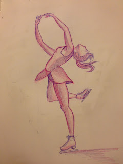
Here are some skating sketches I did to try and lock down some key poses before I went to paint and create them with sand.


Here is what the sand art looks like before editing . In the video I inversed (swapped black and white) this image in order to a create consistency in my piece. 

 more poses...


I used paint, chalk, sand and paper cut outs to create "Skate". I thoroughly enjoyed using such tactile and traditional mediums. At first I was intimidated but as an animator I really enjoyed having an element of chance and freedom in my art making process. I really loved being able to use my muscle memory to create the animation rather than looking at specific reference footage. I felt like I was animating straight from the heart. Animators tend to plan and control their work down to every line. It was wonderful to let loose and let the medium tell a story. 


Tuesday, July 3, 2012

Brotherly Love

Today was awesome. I spent the day at a Blue Jays game with my brother, Dylan. I am so grateful to have a brother that I get along with. He is amazing and although we are separated by distance during the year, (He studies in Ontario and I in Vancouver) it always feels just like the good ol' days when we are reunited.

It was one of those days that I knew I would reflect on later when I missed my brother in Vancouver. 


Singing along to "You raise me up" By Josh Groban 
Ok time to be serious and focus on the road. 
Still havin' a chill ol' time

Go Jays!


Love you Dylan xoxo

Sunday, March 11, 2012

They See me Strollin' They Hatin'...

Today, on our way back from one of our usual work nights at school, we spotted something unusual. A baby stroller just sitting there, abandoned on Granville Island.

So naturally, we shoved my friend Dora into it and posed for a few pictures.


Ma'am, isn't that baby a little big for that stroller?

"Wattsaamatta witchu?? I'm a baby!!"